Product Comparison Page Prompt for AI Builder
Generate professional comparison pages that help visitors make informed decisions between competing products or services with factual, balanced analysis.
Who This Prompt Is For
This prompt is perfect for SaaS companies, digital agencies, and product marketers who need to create transparent comparison pages. Whether you’re comparing your product against competitors or helping customers choose between service tiers, this template generates balanced, SEO-friendly content that builds trust. The result is a scannable, factual comparison page with tables, pros/cons, and clear CTAs that guide decision-making without aggressive sales tactics.
The Prompt
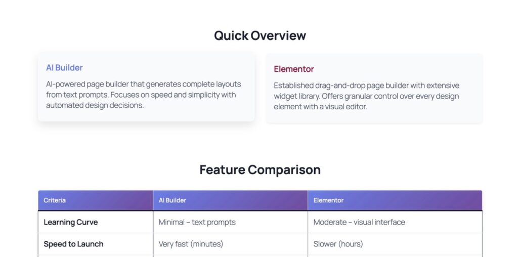
Create a Gutenberg comparison page: {product} vs {competitor}. Include: a comparison table (10 criteria), ‘best for who’, honest pros/cons, FAQ, conclusion + CTA. Tone: factual, non-aggressive. Style: scannable, short sections.
Prompt Variations
- B2B tone: Add ‘enterprise-focused language, ROI emphasis’
- Consumer audience: Add ‘simple language, focus on ease of use’
- Multilingual: Add ‘generate in [French/Spanish/German]’
- Feature-heavy: Add ‘expand table to 15 criteria, include pricing tiers’
Recommended Settings
Design & Style
- Use neutral colors (grays, blues)
- Table with alternating row colors
- Clear visual hierarchy with headings
- Ample white space between sections
Content & CTAs
- Primary CTA: ‘Compare Features’ or ‘Try Free’
- Add product logos in comparison table
- Include 5-7 FAQ items
- Link to detailed feature pages
What You’ll Get
AI Builder generates a complete comparison page with these Gutenberg blocks:
- Hero section with clear product names
- Comparison table block (10+ criteria rows)
- Pros/Cons columns for each product
- ‘Best for’ cards targeting different user types
- FAQ accordion with 5-7 common questions
- Conclusion paragraph with neutral recommendation
- CTA buttons for both products (fair positioning)
Common Mistakes to Avoid
- Being too biased: Avoid one-sided comparisons that only highlight your strengths. Readers spot this instantly and lose trust.
- Ignoring competitor strengths: Acknowledge where competitors excel. Honesty builds credibility and helps users make informed choices.
- Overloading with features: Stick to 10-12 key criteria. Too many rows make tables unreadable on mobile devices.
- Weak CTAs: Don’t use vague buttons like ‘Learn More’. Use specific actions: ‘Start Free Trial’ or ‘Compare Plans’.
- No mobile optimization: Comparison tables must stack or scroll horizontally on phones. Test responsive behavior before publishing.
Generate Your Comparison Page Now
Use this prompt in AI Builder to create a professional, balanced comparison page in minutes. No coding required.