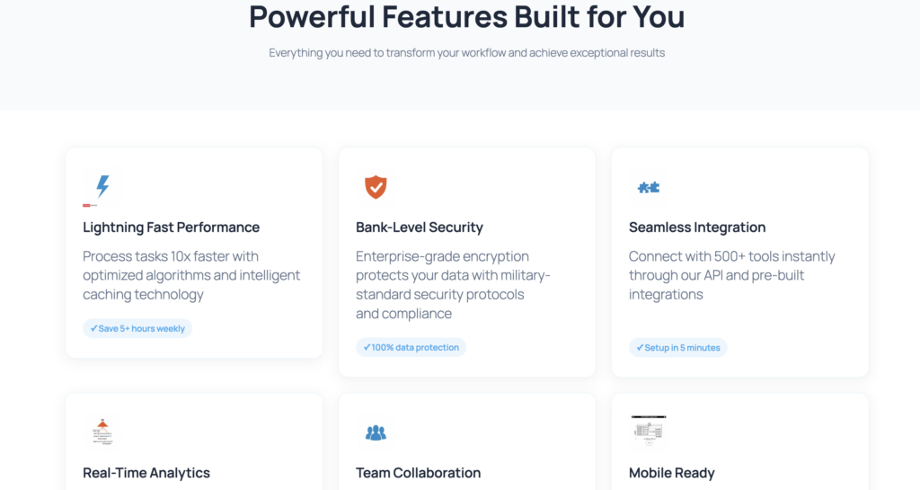
Features Grid Prompt Template
Generate professional product feature sections with AI Builder
Who This Prompt Is For
This prompt is perfect for SaaS founders, product managers, and marketing teams who need to showcase product features quickly. Whether you’re launching a new tool or updating your website, this template generates a clean 2×3 feature grid with icons, concise descriptions, and a ‘How It Works’ section—all optimized for Gutenberg and mobile devices. Save hours of design work while maintaining professional quality and conversion-focused messaging.
The Prompt
Create a Gutenberg FEATURES section in a 2×3 grid for {product}. For each feature: icon (placeholder), title (≤4 words), description (≤18 words), concrete benefit. Add a mini ‘How it works’ block with 3 steps below the grid. Consistent style, separated sections, responsive.
Prompt Variations
- Professional tone: Add ‘Use formal language and industry terminology’
- Startup tone: Add ‘Use friendly, conversational language with emojis’
- B2B audience: Add ‘Focus on ROI, efficiency, and team collaboration’
- B2C audience: Add ‘Focus on ease of use, time savings, and personal benefits’
- French version: Replace with ‘Crée une section FEATURES en grille 2×3 pour {produit}…’

Recommended Settings
Design Style
Use ‘Startup’ style with soft shadows (0 2px 8px rgba(0,0,0,0.08)) and subtle gradients. Apply 6px border radius for modern, friendly appearance.
Colors
Primary: #4672c8 (headings, icons). Secondary: #f9ef80 (accents, highlights). Background: #f8f9fa (sections). Text: #1a1a1a (headings), #4a4a4a (body).
Images & Icons
Use simple line icons (48×48px) in primary color. Keep consistent style across all features. AI Builder generates placeholder blocks for easy replacement.
CTA Buttons
Use action-oriented labels: ‘See All Features’, ‘Get Started’, ‘Learn More’. Primary button: #4672c8 background, white text. Add hover state with opacity 0.9.
Generated Output Example
When you use this prompt with AI Builder, you’ll get a complete features section with the following Gutenberg blocks:
- core/group (container with background and padding)
- core/heading (section title, H2)
- core/columns (2-column layout for features)
- 6× core/column (individual feature cards)
- 6× core/image (icon placeholders with ai-image-block class)
- 6× core/heading (feature titles, H3, ≤4 words)
- 6× core/paragraph (descriptions, ≤18 words)
- core/separator (visual divider)
- core/heading (‘How It Works’ title, H2)
- core/columns (3-column layout for steps)
- 3× core/column (step cards with number, title, description)
- core/buttons + core/button (CTA at bottom)
Common Mistakes to Avoid
- Too much text: Keep titles under 4 words and descriptions under 18 words. Longer text reduces scannability and conversion rates.
- Inconsistent icons: Use the same icon style (line, filled, or duotone) across all features. Mixing styles looks unprofessional.
- Vague benefits: Replace ‘Great feature’ with concrete outcomes like ‘Save 5 hours per week’ or ‘Increase conversions by 30%’.
- Missing mobile optimization: Always test on mobile. The 2×3 grid should stack into 1 column on small screens.
- No clear CTA: End the section with a specific action button like ‘See All Features’ or ‘Start Free Trial’, not just ‘Learn More’.
Ready to Build Your Features Section?
Generate this template in WordPress with AI Builder. No coding required, fully customizable, mobile-ready in seconds.
