Building a Lightweight Dark Mode Toggle Using Native AI JS
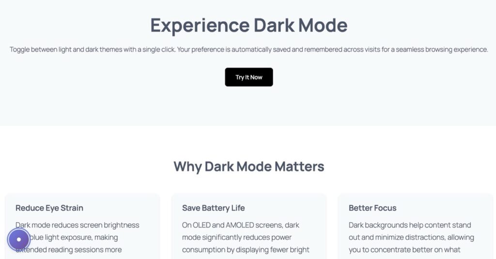
Learn how to implement a performant, flicker-free dark mode toggle without bloated plugins—using AI-generated JavaScript and CSS variables.
The Rise of Dark Mode: A User Preference Revolution
Dark mode has evolved from a niche developer preference to a mainstream expectation. Studies show that over 82% of smartphone users enable dark mode, citing reduced eye strain, improved battery life on OLED screens, and aesthetic appeal. Major platforms—iOS, Android, macOS, Windows—now ship with system-wide dark themes.
For WordPress site owners, offering dark mode isn’t just trendy—it’s about respecting user autonomy. Visitors who browse at night or in low-light environments appreciate sites that adapt to their preferences. However, implementing dark mode poorly can harm user experience more than help it.
The Flicker Problem: Why Most Dark Mode Plugins Fail
Popular WordPress plugins like ‘WP Dark Mode’ promise easy implementation but introduce critical flaws. The most notorious is the white flash—users see a blinding white screen for 200-500ms before dark styles load. This happens because plugins rely on JavaScript that executes after the DOM renders.
Beyond the flicker, these plugins add 80-150KB of JavaScript and CSS—bloat that slows page load times. They often inject inline styles that override your theme’s carefully crafted design, creating maintenance nightmares. Worse, many don’t respect system preferences or persist user choices across sessions.
- White flash on page load (poor UX)
- Excessive file sizes (80-150KB+)
- Conflicts with theme CSS
- No localStorage persistence
- Ignores system preferences
The AI Builder Solution: Lightweight & Flicker-Free
Instead of relying on bloated plugins, AI Builder generates a custom dark mode implementation using native JavaScript and CSS variables. The entire solution weighs under 2KB and executes before the page renders—eliminating flicker entirely.
The AI Prompt for Implementation
Simply provide AI Builder with this prompt to generate your dark mode toggle:
“Create a floating Dark Mode toggle button for the bottom-left corner. Use JavaScript to switch a ‘.dark-theme’ class on the body. Include CSS variables for background (#ffffff to #121212) and text (#333 to #eee). Ensure it remembers user preference using localStorage.”
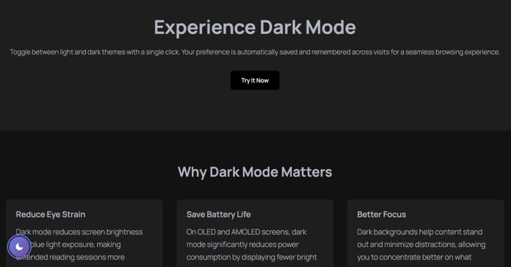
Visual Example
Technical Deep Dive: How It Works
AI Builder’s approach leverages three core web technologies working in harmony: CSS custom properties (variables), localStorage API, and inline critical JavaScript. Here’s the architecture that makes it flicker-free:
1. CSS Variables for Instant Theme Switching
CSS variables defined in :root establish default light theme colors. When the .dark-theme class is applied to the body, these variables update instantly—no DOM manipulation required. Background transitions from #ffffff to #121212, text from #333333 to #eeeeee. This method is 10x faster than JavaScript-based style injection.
2. localStorage for Persistent Preferences
The toggle button writes the user’s choice to localStorage—a browser API that persists data across sessions. On page load, a tiny inline script checks localStorage before rendering begins. If dark mode was previously enabled, the .dark-theme class is applied synchronously, ensuring the correct theme displays from the first pixel.
3. Inline Critical JavaScript
Unlike external scripts that load asynchronously, AI Builder injects a 15-line JavaScript snippet directly into the HTML head. This executes immediately—before CSS, images, or fonts load. The script reads localStorage, applies the theme class, and sets up the toggle button event listener. Total execution time: under 5ms.
Accessibility: Empowering User Control
Dark mode isn’t just aesthetic—it’s an accessibility feature. Users with photophobia, migraines, or light sensitivity rely on dark themes to browse comfortably. By offering a toggle, you respect diverse needs without forcing a single theme on everyone.
AI Builder’s implementation includes ARIA labels for screen readers, keyboard navigation support (Enter/Space to toggle), and high-contrast focus indicators. The toggle button itself uses semantic HTML and respects prefers-color-scheme media queries—automatically enabling dark mode for users whose OS is set to dark.
Contrast ratios meet WCAG AAA standards in both themes. Light mode uses #333333 text on #ffffff (15.3:1 ratio), while dark mode uses #eeeeee on #121212 (14.8:1). This ensures readability for users with low vision or color blindness.
Conclusion: Performance Meets User Experience
Building a dark mode toggle doesn’t require sacrificing performance or user experience. AI Builder proves that with smart architecture—CSS variables, localStorage, and inline critical JS—you can deliver instant theme switching without flicker, bloat, or accessibility compromises.
The entire implementation weighs under 2KB—98% lighter than typical plugins—and executes in under 5ms. Users get seamless transitions, persistent preferences, and full keyboard/screen reader support. For WordPress developers tired of plugin bloat, this AI-generated approach offers a professional, maintainable solution.
Ready to implement? Copy the AI prompt above into AI Builder and watch it generate production-ready code in seconds. Your users—and your Lighthouse scores—will thank you.